Wednesday, December 28, 2022

Workin' for the Weekend, and New Cosplay Drop

Happy end of the year!  My updates have become sporadic, because I've been putting in a lot of hours at Whole Foods.  It's okay, I guess.  One of the best aspects has been exposure to a really wide variety of wine and spirits, which is great because I signed up for the Court of Masters sommelier course.  Also, I won the work raffle for a bottle of Pappy Van Winkle, a high-end whiskey that can retail for a grand or two.  (I plan to crack it open on my birthday.)


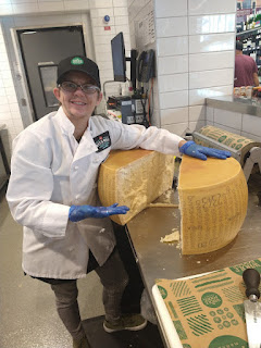
I also got to crack open a 65-pound, $1,000 wheel of Parmesan Reggiano cheese.


But the real reason I work (the real reason anyone works, actually) is to get a bit of extra cash to work on my cosplays.  I have long wanted to do a Silver Age Bucky Barnes, and I finally managed it!  


 (Reference pic.)

I knew that I had done a good job when the best darn Night Crawler I've ever seen approached me at L.A. Comic Con and said I was the best darn Bucky he'd ever seen, and could we get some pictures. 


Below are a few more.


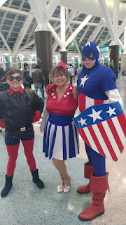
Above, my first time wearing it at SF Fan Expo in November... I forgot the belt, but made a new friend named Robert who does Captain America at Cons and at AIDS LifeCycle!)


Classic Cap!


Modern Cap!  This guy definitely stole the show!

Friday, November 4, 2022

It's Jimmy!

 Hello, blog!  It's been a minute since our last update, because I've been pretty involved with work, as well as my family. 

Somehow, I entirely forgot to mention that I acquired a new dog back in April.  His name is Jimmy Parker, and he is not what I would call an attractive dog.

The manner in which we acquired Jimmy Parker was a typical one: we decided we needed a second dog, and went to the local animal shelter to find one.

Seamus passed away at the ripe old age of 16.5 last November, and for months, we've found ourselves saying, "Time to walk the dogs!"  But there's only one dog, Ruby, and it felt off.

So we decided to seek out a new companion, and we quickly picked out a lovely white-and-blue pitbull named Potter.

Readers with a keen eye might note that Jimmy is not named Potter, nor is he a lovely white-and-blue pitbull mix.

See, when we went to the shelter to meet up with Potter and make sure that Ruby and Potter got along well, we were told that Potter's foster family had had some kind of unexpected emergency and was unable to come meet us.  However, there was ANOTHER dog they thought would be an excellent match.  We'd seen Jimmy at the same adoption event as Potter, and when he was first espied, Andrew had exclaimed, "Ohh, who's this?"  With his single gold snaggle tooth and general aura of silliness, it's hard not to notice Jimmy's whole "goblincore" aesthetic.

Jimmy came hobbling out, and we knew pretty much immediately he'd be coming home with us.

Originally, we were told that Jimmy Parker is a chihuahua, but as he filled out, we realized he is, in fact, mostly miniature pinscher, a dog breed I have never had any interest in obtaining because of their neurotic littleness.  But Jimmy is "one of the good ones" and he's got a ton of personality, and he also allowed me to dress him up as a Ghost Buster for the Spooky Puppy Halloween costume contest at Temescal Brewery, which says a lot about the kind of bullshit he's willing to tolerate.  

He didn't win the contest, but he certainly won our hearts.  So, good job, Jimmy, you ugly little goblin.  Here's to many fine years ahead!

Friday, August 12, 2022

Pan Cosplay

I recently made a cosplay of Pan and I daresay it's my greatest costume to date.

Behold:


For those not in the know, Pan is the Greek god of shepherds, flocks, and the wilderness.

However, in The Gods of the Greeks by Karl Kerenyi, it's noted that "Pan" can also refer to any satyr-like creature who's partying with Dionysus: "In the retinue of Dionysus, or in depictions of wild landscapes, there appeared not only a great Pan, but also little Pans, 'Paniskoi,' who played the same part as the Satyrs."
 
I made this costume for Labyrinth of Jareth (one week away!) and I started with the idea of liking wine a lot and looking very androgynous.  They say play to your strengths, y'know?
 
Note the staff topped with an artichoke.  This is a thyrsus, and I made it myself!

Friday, August 5, 2022

Color Blindness, or Memory Blindness? The Curious History of Crayola and the Color Chartreuse

Hi there, blog!  It's been a minute (or, more accurately, about four months) since I've written anything personal, as I've been busy with private commissions, but today I have a topic I've touched on before: memory.

Specifically, the malleable nature of it, and the Mandela Effect.

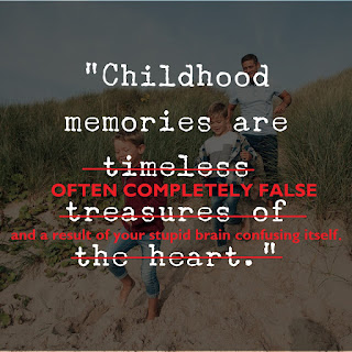
Memory is surprisingly plastic and not nearly as reliable as you might think.  Every time you remember something, you're actually remembering the last time you remembered it; in other words, remembering something is making a Xerox of a Xerox.  For this reason, it's easy to implant memories using the power of suggestion.  In one study, college students were convinced they'd been arrested... in as little as three hours.  

This brings me to the Mandela effect.  The Mandela effect occurs when a group of people remember something differently than what actually happened.  A collective false memory.  The term was coined in 2010 by Fiona Broome, who claimed she remembered Nelson Mandela dying in prison, with lots of news coverage and memorial events.  But Mandela didn't die in prison; he was in prison for 27 years, released in 1990, and went on to achieve presidency over South Africa in 1994.

Broome was not the only one to have "remembered" Mandela dying in prison in the 1980s.   According to Broome, thousands of other shared her memory-that-was-not-a-memory.

Broome wrote an entire book about the Mandela effect and I'm sorry to say that her conclusion about her false memories was that it was evidence of "alternate realities" or of "reality shifting," a dimensional break.

The reality is, in my opinion, more disturbing; our brains have the ability to suggest an idea, and then, each remembrance causes the idea to be embellished, until it's no longer a hypothetical but an actual "memory," one detailed enough to be indistinguishable from other memories.


What happened with Mandela?  Simple: after being in prison for 27 years without updates, people made the (reasonable) conclusion he had died.  And then they brains filled in the gaps: if he'd died, surely there'd been a funeral?  Surely it had been televised?  Surely they'd heard about it?

It's no coincidence that many people's false memories, or Mandela effect experiences, occur in childhood, when the brain is more plastic.  I wrote an article previously about childhood memory and perception.  (Incidentally, the "Lost Episode" of Sesame Street has since been released, and you can view it here.)  And it's not surprising that people can "share" a false memory, since people agreeing on something they're not actually sure of makes it so that both are more likely to consider it correct.  (This is why investigators don't ask "leading" questions; people are inclined to agree when not sure, and search for context clues to "figure out" the truth.)

When it comes to the Mandela effect, usually the memories aren't entirely false; they have a basis in some reality and can be traced or attributed to a false news article, misprint, or similar thing that "actually" happened (even if it didn't).

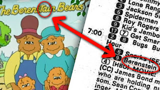
An example is people "remembering" that the Berenstain Bears were the Berenstein Bears. This did actually happen; the name was very frequently misspelled in TV Guides and on unlicensed toys, so they likely did see it spelled as "-stein."


I have experienced the Mandela effect only once, but it did lead me to a feeling of recollection vertigo.

My Mandela effect: for a long time, I and many others thought that the color "chartreuse" was red.

It's actually green.


I'm not the only one who thought of chartreuse as red, but if you read this excellent article (also linked above) from The Paris Review about the color, you'll see no such confusion existed in the heyday of the color.  Named in the 1880s, the height of its popularity was in the 1920s.  Most people who think of chartreuse as "red" were born between 1970 and 1990.   What gives?

Well, I did my research and discovered that the confusion seems to come from Crayola, which released a red-orange crayon in 1972 named "chartreuse." In 1990, the crayon was renamed to "Atomic Tangerine" but the confusion remains for Gen Xers and older Millennials, who associate "chartreuse" with red hues.

Curiously, although the crayon was more orange than red, and had a fluorescent / neon hue to it, most people who remember chartreuse as red describe it as a dark brick, burgundy, or maroon.  But there's a simple explanation for this.  The color derives its name from an alcoholic drink and that people get their wires crossed and think of it as being some kind of French wine.  A lot of people claim it "sounds" red.  I believe that's another case of crossed wires: there are other red colors, like cherry and cerise, with similar names.


Let 's jump into a Crayola timeline for a better look at chartreuse.

Crayola began in 1903 with eight colors in each box.  Coincidentally, in the same year, the French government took over the Chartreuse distillery.  Jury's out on just how connected these two things are, but my intuition tells me "completely."

Anyway, in 1949, nearly fifty years later, Crayola released 40 more colors, which directly led to the collapse of the Berlin War forty years later.

Just kidding, although it's worth pointing out that one of the colors released in 1949 was "Prussian blue," and this was changed to "midnight blue" in the '50s.  (The company figured no one would remember the color as being the color of a Prussian uniform post-WWII era.)

So bear this in mind: Crayola can and does change color names.

In 1972, with 64 colors on the roster, Crayola introduced eight more.  The 1972 "fluorescent" line contained an ultra orange, ultra yellow, ultra green, ultra pink, ultra blue, ultra red, combo-breaking "hot magenta"... and chartreuse.

In 1990, ultra orange became outrageous orange, ultra yellow became laser lemon, ultra green became screamin' green, ultra pink became shocking pink, ultra red became wild watermelon, and chartreuse became atomic tangerine.  

However, Crayola still retains a "chartreuse" crayon (#FFFF66).  In a search for the legendary red chartreuse, I came across a list on Wikipedia, which claims that "chartreuse"was actually changed to laser lemon and "ultra yellow" was changed to "atomic tangerine." It makes little sense to me that a color called "yellow" would be changed to "tangerine."  And all other sources seem to think that chartreuse and atomic tangerine are the same. 

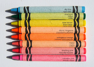
Here's a picture of "atomic tangerine" next to laser lemon, and as you can see, they are completely separate colors, and laser lemon is yellow, not red-orange:


I am forced to conclude that Big Crayola is manipulating the Wikipedia page to cover their tracks.

It's worth noting that Crayola's most senior crayon maker, Emerson Moser, who worked in a crayon plant pouring the waxes into molds and putting said molds through the papering machines, who made over a billion crayons in his 37-year-long career, was color-blind

His year of retirement? 1990.  The same year that "chartreuse," a pale green that would be indistinguishable from orange-red with someone with colorblindness, had its name "fixed."  (Nowadays, chartreuse is called "green yellow.")   

It's possible the "chartreuse" mistake/inconsistency can be directly attributed to him, but Crayola has never offered an explanation.

Thursday, March 31, 2022

It's Not Just You: Why People Hate "Corporate Art Style"

This article was originally written for and published by the Grand Geek Gathering on March 30th, 2022.

You’ve probably seen it and you probably hate it.

It’s corporate art style, and it was originally developed for Facebook, but is now in use by just about every other big tech and start-up out there: Google, YouTube, Airtable, Hinge, Uber, Lyft, GrubHub, and Airbnb, to name a few.

What is this art style, and where did it come from?  More importantly, why is it so universally hated?

Jump in the world of inoffensive pastels, noodly arms, and flat, 2-dimensional vector drawings as we examine what makes Corporate Art tick!

What is it?

There are many features of Corporate Art.  Often described as “minimalist” or “flat,” its major distinguishing features include use of primary shapes, uniform line widths, minimal line work, little texture, and minimal tonal shadows to convey depth.

The humans depicted by Corporate Art have non-representational skin tones, often pastels or cool colors like blue and purple.  They also have long, oversized limbs or other exaggerated features, which often have a “wiggly” or “flowing” movement when animated.  While the arm and legs have uniform length and width (with only the slightest taper to the stubby fingers), the heads are small compared to the body, and the eyes are dots with lines for eyebrows.

Examples of this art, from an actual Facebook artist’s portfolio, can be found here.

Where did it come from?

It goes by many names, despite having little variation.  Corporate Art Style, also called Big Tech Art Style, Flat Art, Globohomo Art Style (short for “globalized homogenization”) and Corporate Memphis, was developed for Facebook in 2017 by a design firm called Buck.

Specifically, the design is heavily credited to artist Xoana Herrera and animator Esteban Esquivo.


An early example of the duo's work

This art style was originally called “Alegria,” Spanish for “joy.”

“Corporate Memphis” was coined in 2018 and refers to the Memphis Group, a widely-loathed postmodern Italian architectural group from the 1980s whose designs typically included flat, geometric, and colorful features.

The characterization of Corporate Art online garnered notice from a Twitter account @HumansOfFlat, which amassed 6,000 followers and collected examples of the art to criticize and ridicule it.  The account was suspended in 2019.

But this particular account wasn’t alone in its hatred of the style.  On August 21st, 2019, Aiga Eye on Design blog published an article titled "Don’t Worry, These Gangly-armed Cartoons Are Here to Protect You From Big Tech," which remains one of the first Google results when you search for corporate art style analysis, and is also the first citation on Wikipedia when you visit the Corporate Memphis page.

On February 6th, 2021, YouTube channel Solar Sands posted a video decrying the art style as “fake.”  It received over 2 million views in its first month and currently sits on 3.8 million views.

Watching the video myself, I was treated to an ad for Google Fi that used– yep, you guessed it– this very same art style.  It’s everywhere.  I'm pretty sure I even used some stock images in my last article.

Why do tech companies love it so much?

For tech companies, corporate art style is incredibly useful.  For one thing, the art is vector-based and easily replicable.  This means that instead of needing to pay one artist, you can have a whole team of graphic designers who make uniform, consistent art.  This art style renders the graphic designers easily replaceable.  What’s more, it can be rapidly created in programs like Abode Illustrator with little effort or time.

The non-representational skin tones are both inoffensive and “inclusive.”  And the minimalism, paired with the movements depicted, makes for exciting, “playful” art that does a good job of representing what the companies are trying to communicate about themselves: that they are accessible, fast-paced, and fun.

Unfortunately it’s very quickly become despised by most people.

Why do we hate it so much?

A lot of artists and graphic designers have chimed in to offer opinions on why this art style, which is designed to be inoffensive, seems to have had the opposite effect.

Some suggest it’s the “grotesque” proportions of the people, which trigger an uncanny valley response.  Others have said that the art style is “obnoxiously joyful” and that the “constant motion” causes visual fatigue.  Still more believe that the issue is that people are aware that the non-representational skin tones are tokenizing and that, in its efforts to be inclusive and diverse, the people end up representing no one at all, leading the audience to feel pandered to.

But all of this, to me, falls into a bigger issue, which is that the art doesn’t feel like authentic art.  This art carries no emotion and conveys no message other than to hype a product.

The art is definitionally “corporate” with no underlying message

But it doesn’t have to be.  The truth is, minimalist art is often very good.  But the corporate style has so thoroughly saturated the market that we tend to see it, immediately identify and associate it with Big Tech branding, and then dismiss it as "noise" without considering its artistic merits, if any.

The truth is, flat, minimalist drawings with tonal shadows, exaggerated limbs, soft colors, and primary shapes is a legitimate art style.  We’ve seen it used with finesse in the Bauhaus and Art Deco schools of art, and indeed, I’ve heard it said that this style is a natural evolution of Art Deco and builds on the kind of art made by A.M. Cassandre (who, it should be noted, famously made his art for advertisements).

 
An example of A.M. Cassandre's work.


Vintage globohomo?

In fact, one of my favorite paintings of all time is a minimalist vector piece of art, which has several similarities to Corporate Art: minimal line use, exaggerated features, tonal shadows.


"Two Hours Past Bedtime" by Shag

But the thing about this piece of art is that it tells a story, and conveys an emotion.  It’s not trying to promote any product other than itself.  Like all good art, it’s representational and thought-provoking.

And that’s precisely what corporate art style lacks.

But there's good news!

The extreme dislike of Corporate Art has prompted people to create creative parodies which are, in fact, art.  Ironic and satirical, the parody art makes a statement and evokes emotion: humor at the image, annoyance at the style, and appreciation for the commentary.

Two of my personal favorite pieces of Corporate Art parody include a recreation of Francisco Goya's Saturn Devouring His Son, and of Artemisia Gentileschi's Judith Slaying Holofernes.  The "pleasing, soothing" minimal and color scheme, paired with the violence of the imagery, makes for an unsettling and comedic piece of true art.

So perhaps not all hope is lost for this flat, minimalist style.  We may hate it because we associate it with unskippable YouTube abs, but we can't deny that it's exerting a powerful influence over how we consume and respond to art.

Friday, March 25, 2022

Content Dump: I Dislike Tik-Tok.

I'm not a huge fan of TikTok.

Actually, no, scratch that, I hate TikTok.

Aside from finding the interface really busy and unpleasant to look at because of what a sensory overload it is, I think TikTok's culture is incredibly toxic.  Like Facebook, it's a polarizing social media platform that allows people to go on short video diatribes about their "hot takes," everything from science denial to extreme social justice posturing.

Here's a link to the article.

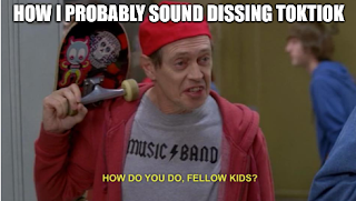
This meme has a typo.  Deal with it.

I don't want to say TikTok has no redeeming features.  It's given us some degree of creativity, such as the revival of sea shanties.

But my big problem with it is that it seems to really push a "mental health awareness" narrative that has resulted in a ton of people self- and mis-diagnosing.  Now, I don't want to simply invalidate every self-diagnosis.  If they're used to communicate something meaningful then I'm all for it. But if they're used to excuse or justify toxic behavior then I'm not. I guess I care less about where the label came from and more why someone is using it... if it helps me to understand a person better then I don't care whether or not they've got a slip of paper from a doctor. 

But diagnoses have a purpose.  The purpose is 1) to characterize a disorder to better understand what the person who suffers from it is experiencing, and 2) to formulate a treatment plan that alleviates the symptoms.  It's not meant to be used for clout, as many of the people on TikTok do, presenting their mental health as "quirky" or "fun," a stand-in for personality.  And, again, it's not meant to excuse toxic behavior, which I've seen as well.  I know two people who use TikTok and both have, over the course of the last year, begun to explain away bad behavior by dropping a slew of acronyms on me.

On TikTok, mental illness on social media is treated the same way astrology is.  You make a highly relatable and broad post about how "people with X experience Y!" and then make the experience into an incredibly vague, general human experience.  A classic example is sharing a picture of misaligned tiles and claiming that it upsets your "OCD." People with OCD can certainly find it annoying, but it's not exclusive to them, nor is it diagnostic criteria. 

There are many people, especially easy influenced teens who can't even be diagnosed with personality disorders at their age, who "find their own" diagnosis, go to doctors with a confirmation bias, and end up with a diagnosis and treatment plan that is deeply harmful and will follow them for the rest of their lives.
 
What's more, the "movement" of "mental health awareness" on TikTok has become so cult-like that there's terminology for people who call out bad behavior.  These people are called "fakeclaimers" and that's a fancy way of saying that they're suppressive persons whose questioning of any TikTok featuring a person with a disorder is inherently problematic.  This cult-like behavior is not dissimilar to what we see with the "body positivity" movement, a thing that could have actually been good and uplifting but has ended up with such extreme viewpoints that it's become extremist and dangerous.

This has solidified my dislike for TikTok and I was glad that the GGG let me write the above article on it, because I know it's a bit of a hot take.  I enjoy having the creative freedom to be able to express my opinions, and it's something I wish more TikTokers would employ instead of leaning on the sensationalism or glamorization of possibly-misdiagnosed mental disorders.  

Wednesday, March 16, 2022

Heave, Ho: an article on sea shanties and other things I'm up to.

Recently I wrote an article about sea shanties.

You should go read it.  It's very informative, because I happen to be a big fan of sea shanties.  I'm not sure why but lately, in particular, they've really been resonating with me...

Anyways, in unrelated news, I recently got a new job at Whole Foods.  It's a little part-time side hustle working in wine and cheese, which is very bougie, I know.  It's a way for me to get some much-needed time out of the house so I stop writing articles gate-keeping sea shanties.  So far I love it; I got hired at an on-site job fair I stumbled into accidentally.

Directions unclear; ended up with a wage job.

I've found all of the other team members to be enthusiastic and welcoming people, and the work, while relatively simple, is extremely satisfying to me in the way simple, manual labor often is (when you're opting in, that is).

That being said my commission work has also been going splendidly (which is why my posts here are getting shorter... sorry, blog, but you don't pay me because you're proudly ad-free and also no one actually reads you).  I've got one client in particular who is a darling to work with and whose stories and characters are really fun to explore and frankly very risqué.  Unlike with kids or dogs, I can absolutely choose favorites and S is my favorite client to work with, hands-down.

So, here's to you, patron S and Whole Foods, for keeping me physically and intellectually stimulated, productive, and gainfully employed.  May the two of you never, ever intersect.

Friday, March 11, 2022

Content Dump: Mystery Science Theater 3000 Is Back, Baby!

I'm a big fan of Mystery Science Theater 3000.  It's back and I wrote an article telling you everything you need to know about their new streaming platform.

While I'm not a fan of paying for multiple subscriptions and love the convenience of getting my media fixes from a single place, I have to admit that the decentralization of art is probably better for creators, and I'm definitely willing to throw a few dollars toward the Gizmoplex if it means I finally get to see MST3K take down Munchie.

Friday, March 4, 2022

Content Dump: ComiXology’s 4.0 Update Disaster (And Alternative Platforms for Digital Comic Consumption)

Right on the heels of my recent post about graphic novel recommendations, ComiXology, an app for digital comic purchase and reading, updated, and the update was nothing short of a dumpster fire.  It was nearly universally hated.

I'm happy to report that this update didn't affect me much, because I don't read books digitally.  I'm a paper-and-ink kind of guy, with the bookshelves to prove it.

Look at all those dead trees!  Take that, plants!

But I saw an opportunity for an article and so if you'd like to read it, you can check it out by clicking here.  This article explores why the ComiXology update was so devastating for the platform's users, and offers ten alternative platforms for those who prefer digital versions of graphic novels.

This was also a nice tie-in to my previous article about comic books because of the involvement, once again, of the Comic Book Legal Defense Fund, which provided some tips for readers on how to access comics (including digitally!) using their library and free apps like Hoopla, OverDrive, and Libby.

Speaking of comics, I've gotten my press badge confirmed for WonderCon in Anaheim next month, and I'm really looking forward to it, not in the least because Trevor reached out to me and asked if I wanted to meet up and grab drinks.  Really looking forward to seeing my friends, especially since moving, I've been feeling a bit isolated.

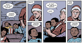
Winter Friends confirmed?!

Sunday, February 27, 2022

I lost my cat and it was the longest three days of my life.

San Francisco has an earthquake problem.

You already know this.  The thing you might not know, unless you live on a fault line, is that most earthquakes go unnoticed.  There's plenty of loud ones that shake the walls or roll the streets, but many more little ones that cause paintings to end up very slightly askew.

A recent earthquake shifted our door frame infinitesimally and created a major problem, which is that the latch on our front door became loose and would pop open every time the elevator for our floor came to our level. 

This was only a mild annoyance at first, but the situation quickly got worse.  You see, we have a corner unit.  This is great because we don't share any walls with anyone.  One side of the unit is the balcony that overlooks the street, and on the other side, where our one neighbor should be, there's a hallway that leads outside.  This side entrance has two doors, an exterior and an interior one, and both lock.  Secure, right?  

Not when the neighbors keep propping open the doors.

This brings me to the story of the day.  On Thursday night, our front door popped open, and we woke Friday to discover our front door very slightly ajar and the cat missing.

Our cat, Mabel Syrup, is probably best described as "pathetic."  An 8-year-old indoor cat with a perchance for excessive, anxious grooming, Mabel is very pretty but not very smart.  We found her as a kitten, when she was no bigger than a soda can, and until the move, she'd lived her whole life in the same house.


 She is not what you might call "street-smart."  Or smart at all, really.

Now she was lost in an unfamiliar environment, and I had no idea where she was or when she'd be back.

If you've ever lost a pet you know just how terrifying it is not knowing what's become of them.

We immediately went on a full search worthy of "Gone Girl."  (A movie, and a book, that would have been objectively better if there were a cat instead of a bunch of boring, shallow, problematic human characters.)

I printed up about 50 fliers and determined a reasonable search radius, praying that Mabel wasn't trying to pull a Homeward Bound: The Incredible Journey on us.  Information on the internet varies, but Mabel, being a spayed, middle-aged cat with a milquetoast personality seemed like she wouldn't venture further than a 3-mile radius.  Just to be sure, I drew up a map of a 4-mile radius, which included the Rose Garden, a place I was sure a cat might be interested in visiting due to the wildlife and the running water in the fountains.

Mabel loves wildlife, by which I mean indoor wildlife.

I spent the morning on Friday panicking and trudging my way around the neighborhood, putting up a flier on every corner until I ran out of tape.  I covered over ten miles in concentric circles.  I shook bowls of food and called for her; I put out notices on every platform I could find, including NextDoor, and called up Oakland Animal Services, visiting the shelter to drop off a dossier.

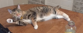
This is the photo we used for the posters.

Mabel became the Grand Lake neighborhood Most Wanted.

The calls rolled in.  Someone saw a cat here, someone saw a cat there.  Some of the alerts were for cats who looked nothing like her.  Others looked worrying like her.  Over the weekend I got two different calls about dead cats that I had to go check; neither was her.  Every call prompted a desperate feeling of hope and then, when the cat turned out not to be Mabel, a crushing disappointment.
Because of the excessive efforts to find her, everyone in the area became invested in the story.  

"Have you found her?  Is this her?"  I heard these questions over a dozen times.  Every call was like a 911 call that had me grabbing my jacket and racing to go see if I could nab her, only to discover it was never her to begin with.

The house felt empty.  Having lost Carlisle and Seamus in the last two years, we were down to our last dog.  Mabel had helped it feel less empty, but with her missing, we were suddenly very aware of how few pets we had compared to our previous zoo.

We also lost Winibelle the rabbit in 2019, who was one of Mabel's best friends.

Then, finally, a match!

Someone called us to inform us that there was a cat hiding under their porch that had been there over two days and seemed distressed.  They had been sliding food and water under the deck but the cat wasn't eating, just crying occasionally.

I went down to discover that this was indeed Mabel.  

Home at last!

Before we had moved, I had made sure to get Mabel and Ruby new tags on their collars that would be easily read, but the tag hadn't mattered in the end.  It was the posters that did it.  

How far had Mabel ventured?  About 400 feet, only three lots down from our building.  She hadn't ever made it to the Rose Garden.  Her Incredible Journal had terminated within calling distance, but Mabel, lacking agency and not being the brightest crayon in the shed, had opted to just give herself up to death once faced with the inhospitable elements of California in the spring.

I dragged Mabel out, filled with relief, and took her home.  I then went on a trek to pull down all the fliers and to update all of the notices.  Mabel's return was met with delight from the neighborhood, but overlooked by my building's super, who called me Sunday night to inform me, with joy, that she'd found my cat in the laundry room.  She even sent a picture of a cat that matched Mabel's description almost perfectly.

Confused, I went up to the laundry room to retrieve the second cat.  Wedged into a crevice and crying pitifully, the cat was a dead ringer for Mabel, although easily twice her size, and male.  He had no collar.  We dubbed him Chonkers and brought him up, putting up a few "found" posters, which confused everyone who had invested themselves emotionally in the Mabel Saga.

Tony's Home For Wayward Mabel Doppelgangers was short-lived.  We had Chonkers for about two days before we discovered a Lost poster for him.  His name was Banzo, a Brazilian slang term for the lazy feeling one gets after eating a lot, which suited him about as much as "Chonkers."
 

Chonkers was picked up by his owner and, finally, all cats were home.  

From this story I learned two things.  
 
First, the absolute necessity of "Lost" posters for animals.  If you are a pet owner, do yourself a favor and make a poster now instead of trying to create one when you're in a state of panic over the lost animal.  Make sure you have a current picture to put on it.  Both Banzo's owner and I used color photos, which was instrumental in having people call us to return our pets.
 
Second, having endured three days as a "one pet" household (no offense to our many tanks of lizards), we realized we're probably ready to begin the process of getting a new dog or cat.  We were prepared and even eager to keep Banzo if no one claimed him.  Nothing can replace Seamus, but there's room in our hearts for a new family member, and a lot of dogs out there need homes.  We're in no rush but sooner rather than later, I think we'll start looking.
 
It's a shame we didn't get to keep Chonkers/Banzo, since Mabel and Ruby had just started to like him.

As for the building, we put in a service request and had our door fixed to prevent this from happening again, and I personally whipped out a screwdriver Tommy Pickles-style and removed the door stop from the side entrance so that people would stop propping it open.

For the folks who "hosted" Mabel under their deck for two-and-a-half days, I made good on the poster's promise of a reward, and dropped off a bottle of Dubonnet.

Sunday, February 20, 2022

The Lost Relevancy of The Simpsons (And The Case For Reboots)

Sometimes I see a meme that encourages me to write a whole article.  

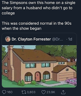
Recently there's been a couple of memes and Tweets floating around regarding the wealth of the Simpsons family.  

I post a lot of Simpsons .gifs on this blog, mostly just because they're so readily available and there's one for everything.  I was born in the '80s and so I got to enjoy the best age of the Simpsons at the height of its popularity.

But I haven't seen an episode in ten years.  In fact, I can recall, with crystal clarity, the last episode I saw.  

The Simpsons had already stopped being especially interesting to me, but watching it weekly was an ingrained habit at that point.  I did it without much thought or enthusiasm.  

But then, in May of 2012, I saw the 22nd episode of season 23, the infamous Lisa Goes Gaga.  That was the episode that was so bad that I was able to quit my Simpsons addiction cold turkey.  It was the lowest rated Simpsons episode to have ever aired at that time, with good reason.  It was pointless hero-worship; the episode's plot was that everyone in Springfield loves Lady Gaga.  That's pretty much it.  

 Lisa has a heartfelt discussion with Lady Gaga, becomes a fan, and there's a big song and dance number.  Seeing Lenny (Lenny!) dancing to Lady Gaga was the most gag-worthy thing I'd ever seen on the Simpsons and it was an indication to me that the show had completely lost itself.

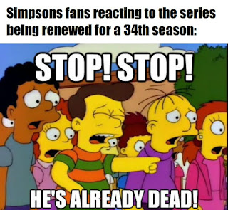
Lisa Goes Gaga was painfully derivative of the episodes Lisa's Substitute and of Summer of 4 Ft. 2, and gave us nothing except for incredibly heavy-handed hero worship and some tame, censor-approved "edginess."  That episode, for me, was the death of the Simpsons, and every time the show gets renewed for yet another season, I wince a little.

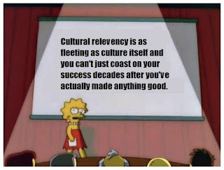
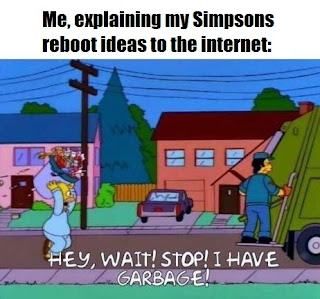
The relevancy of the Simpsons collapsed under its own success.  And while I know everyone likes to complain about franchises being rebooted, the Simpsons is one I would love to see rebooted to make it once again culturally relevant.  I recently saw Spider-Man: No Way Home in theaters, and every single trailer was a reboot: Matrix, Batman, Top Gun.  Reboots don't have to be bad; sometimes, retelling a story through a new cultural lens can breathe life into it.  I don't dislike reboots simply for being reboots; if they're offering a fresh take using familiar characters, then they can really resonate with people and provide useful commentary on present social and political issues.

Without further ado, here's a link to an article I wrote about the lose relevancy of the Simpsons, originally published on the Grand Geek Gathering on February 17th, and my proposal for a reboot.  It ain't much but, hey, neither is the Simpsons.